

Introduction
When it comes to branding, colors play a pivotal role in conveying your company’s identity, values, and personality. Selecting the right brand colors can make a lasting impression on your audience and differentiate you from competitors. In this article, we will guide you through the process of choosing your brand colors to create a cohesive and impactful brand identity.

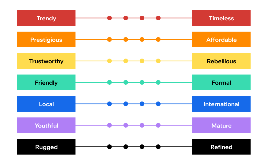
image source: wix.com
1. Understand Your Brand Identity
Before diving into color selection, it’s crucial to have a deep understanding of your brand identity. Start by defining your brand’s mission, values, and target audience. What emotions or associations do you want your brand to evoke? Is your brand modern and innovative, or traditional and dependable? These insights will provide valuable guidance in choosing colors that align with your brand’s personality.
2. Research Your Industry
An essential step in selecting brand colors is to research your industry. Analyze the colors commonly used by your competitors and consider whether you want to blend in or stand out. If most companies in your industry use a specific color palette, you may want to differentiate yourself by choosing complementary or contrasting colors.
3. Consider Color Psychology
Colors have the power to evoke specific emotions and perceptions. Understanding color psychology can help you choose colors that resonate with your target audience. Here’s a brief overview of some common color associations:
- Red: Passion, energy, excitement
- Blue: Trust, professionalism, calmness
- Green: Growth, health, nature
- Yellow: Optimism, positivity, warmth
- Purple: Luxury, creativity, sophistication
- Black: Elegance, authority, mystery
Consider which emotions and qualities align with your brand, and choose colors accordingly.
4. Create a Mood Board
A mood board is a visual representation of your brand’s identity and desired aesthetic. Collect images, color swatches, and design elements that resonate with your brand. This can help you visualize how your chosen colors will work together with other design elements like typography and imagery.
5. Test Colors for Accessibility
Accessibility should be a priority in your color selection process. Ensure that the colors you choose provide sufficient contrast to make your content readable for all users, including those with visual impairments. There are online tools and guidelines, like the Web Content Accessibility Guidelines (WCAG), to help you ensure your colors meet accessibility standards.
6. Limit Your Color Palette
While it may be tempting to use a wide range of colors, it’s best to limit your brand’s color palette to a primary and secondary color. This simplifies your brand’s visual identity and makes it easier for customers to remember. Additionally, choose colors that work well together and can be used consistently across all branding materials.
7. Get Feedback
Don’t make the decision in isolation. Seek feedback from team members, stakeholders, and potential customers. Share your color choices and mood board to gather opinions and insights. This collaborative approach can help refine your color palette and ensure it resonates with your target audience.
8. Test in Real-World Applications
Before finalizing your brand colors, test how they look in various real-world applications, such as on your website, business cards, and merchandise. Colors may appear differently in different contexts, so it’s essential to ensure they maintain consistency and effectiveness across all platforms.
Conclusion
Choosing your brand colors is a significant step in creating a strong and memorable brand identity. By understanding your brand, researching your industry, considering color psychology, and seeking feedback, you can confidently select a color palette that resonates with your target audience and helps you stand out in the market. Remember that your brand’s colors are more than aesthetics; they are a powerful tool for conveying your brand’s personality and values.